Verizon Workplace Brand Guidelines

The Verizon workplace brand guidelines are informed by the brand’s north star, purpose and long term targets: moving the world forward takes the best technology, best network, and the best people.
At Verizon, we move toward a common goal every day by driving meaningful changes and creating innovative solutions together. Our workplace brand experience is a big part of how Verizon can achieve this and become a company that is viewed in the same breath as Amazon, Apple, Google, Facebook, and Microsoft.


Guidelines


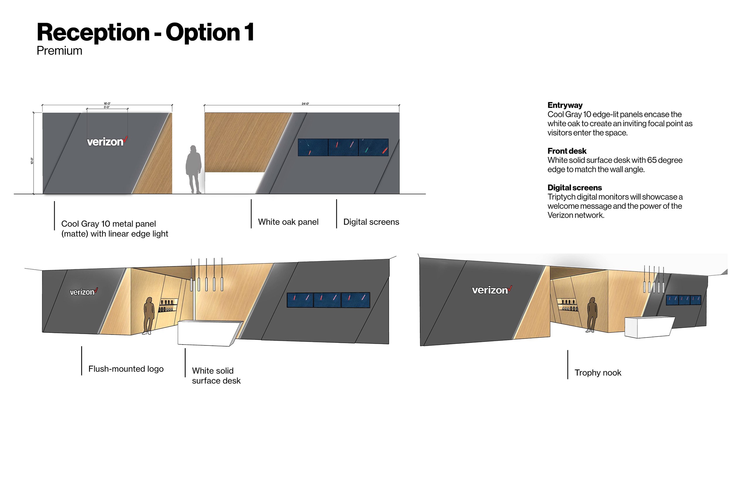
Reception
Through the use of our brand standard look and simple accents, we welcome all employees and visitors with warmth. The clean lines and palette result in an entryway that ties back to the brand’s core.


Public-Facing Communal Walls
As employees and visitors move into the Corporate Center, we showcase how we are driving toward a meaningful goal of creating innovative solutions for the world. We also have branded moments throughout the spaces that connect the public-facing communal walls to employee-facing communal walls.
Employee-Facing Communal Walls
As employees move further into the Corporate Center, we celebrate the best people and the best network by showcasing our employees, the power of Verizon’s network and our brand core.


Workspace Brand Pattern Wayfinding
Depending on the Corporate Center, each floor or zone is identified by a number and brand pattern. The patterns function as wayfinding and support the purpose of each room. They also help set an inviting tone for focus rooms, chat rooms and conference rooms. Above are examples of how the patterns may be used in different types of Corporate Centers. We will explore what the centers might look like if it had 4 floors.
Floor specific identifying patterns are consistent throughout each floor. Patterns consistently show up from the elevator bank to the employee work spaces (focus rooms, chat rooms and conference rooms) for wayfinding purposes and to act as an accent to the space.


Cafe
Nobody knows more about the power of networks than Verizon. Our network is not only about the best technology, but it’s also about the best people that work at this company.
Through the use of wood, greenery, soft lighting and photography, the warm cafe invites all to take a break with our work family. All employees are encouraged to connect with each other and foster a community.


Gym
Through the use of encouraging messaging and bold typography, we lead employees into the fitness centers to achieve their total mind and body wellness. The dichroic film on the wall will vibrate and energize anyone who passes by. The slash abstractions express movement and forward progress.
Role
Creative Direction
Concept & Design Lead
Project Type
Branded Space
Environmental Graphics
Signage
Wayfinding
Employer
Verizon CMG
Client
Verizon Real Estate Group